
Vector vs. raster
At the most fundamental level, images for the web fall into two categories: vector and raster. Raster images, like those created in Photoshop, are composed of a grid of pixels. Each pixel holds color information, and together these pixels form the image. Vector images, on the other hand, are built using mathematical equations that define points, lines, curves, and shapes. This difference in how image data is stored has huge implications for web performance.
Think of it like this: a raster image is like a mosaic – the more pieces (pixels) you have, the more detailed the picture, but also the heavier it is. A vector image is like a set of instructions for drawing the picture. The instructions themselves are lightweight, and the picture can be scaled to any size without losing clarity. This scalability is a massive advantage for responsive web design, where images need to look sharp on everything from a phone to a large desktop monitor.
Browsers handle these types differently. A raster image loads pixel by pixel. A vector image renders shapes based on math. While vectors are efficient for simple icons, complex paths can strain a processor. Choosing the right one depends on balancing that rendering load against file size.
When to use SVG
SVG – Scalable Vector Graphics – is currently the go-to format for many web designers. Its biggest strength is, unsurprisingly, scalability. You can zoom in on an SVG image indefinitely without any pixelation or loss of quality. This makes them perfect for logos, icons, and illustrations that need to look crisp at any resolution. Because they're text-based, SVG files are often smaller in size than raster images for similar graphics, leading to faster page load times.
Another significant benefit is editability. You can open an SVG file in a simple text editor and modify the code directly, changing colors, shapes, or animations. This is incredibly useful for making quick updates or creating dynamic graphics. SVGs also offer accessibility advantages; the text within an SVG is selectable, which aids screen readers and improves SEO. Many developers are leveraging SVG for animation, using CSS or JavaScript to manipulate the vector paths.
SVG has limits. Hundreds of paths and gradients create heavy files that lag on older phones. Security is another factor; since SVGs are code, they can carry XSS attacks if you use files from untrusted sources. Always sanitize your code before deployment.
Finally, while SVG is incredibly versatile, it's not ideal for photorealistic images. Attempting to vectorize a photograph often results in a bloated file size and a poor representation of the original image. For these scenarios, raster formats are generally a better choice.
PNG: The Raster Workhorse
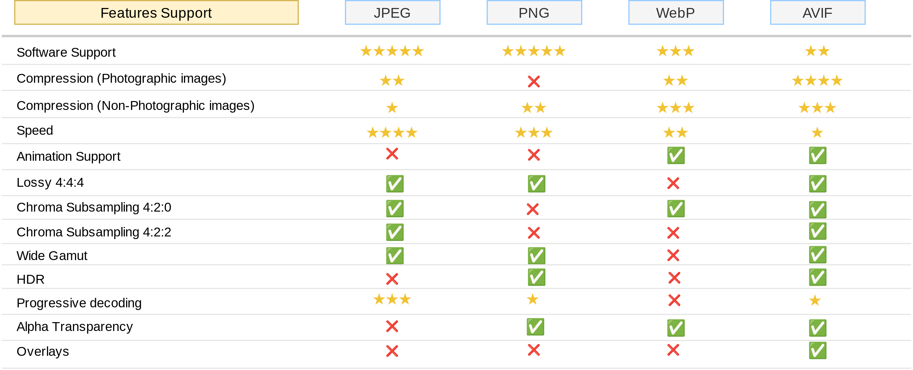
PNG – Portable Network Graphics – has been a staple of the web for decades, and for good reason. It utilizes lossless compression, meaning no image data is lost during compression, preserving image quality. This makes it ideal for graphics where detail is important. PNG also supports transparency, allowing you to create images with transparent backgrounds, which is crucial for logos, icons, and web design elements.
Its widespread browser compatibility is another major advantage. Virtually every browser supports PNG, ensuring that your images will display correctly across different platforms and devices. PNG is frequently used for screenshots, detailed illustrations, and graphics that require transparency. However, PNG files are generally larger than optimized SVGs for simple graphics.
There are two main types of PNG: PNG-8 and PNG-24. PNG-8 uses an 8-bit color palette, limiting it to 256 colors, which results in smaller file sizes but can lead to banding in images with subtle color gradients. PNG-24 uses a 24-bit color palette, supporting millions of colors, providing better image quality but also larger file sizes. Choosing between PNG-8 and PNG-24 depends on the specific image and the desired balance between quality and file size. When scaling PNGs, you’ll inevitably encounter pixelation.
WebP: the modern standard
WebP, developed by Google, is a modern image format designed to provide superior lossless and lossy compression for images on the web. It consistently outperforms both PNG and JPEG in terms of file size while maintaining comparable or even better image quality. WebP supports both transparency and animation, making it a versatile alternative to PNG and GIF.
Its superior compression is achieved through advanced compression algorithms. This means you can significantly reduce image file sizes without sacrificing visual fidelity. While browser compatibility was initially a concern, support for WebP has been steadily increasing. As of late 2023, most modern browsers – Chrome, Firefox, Edge, and Opera – fully support WebP.
However, Safari’s support was limited for a long time, and it's still important to provide fallbacks for older browsers that don't natively support WebP. This can be done using the `` element in HTML, allowing you to specify different image formats based on browser support. While precise adoption rates for 2026 are hard to predict, the trend clearly favors WebP.
- Use the `` element for browser fallbacks
- Consider a WebP conversion service for automated format delivery
- Test WebP performance against PNG/JPEG on your target audience’s devices
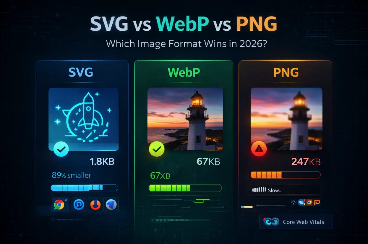
Image Format Comparison: SVG vs. PNG vs. WebP (2026 Outlook)
| Feature | SVG | PNG | WebP |
|---|---|---|---|
| File Size | Small for simple graphics, can increase with complexity | Medium to Large, dependent on image detail | Generally Small to Medium, excellent compression |
| Scalability | Excellent – scales without loss of quality | Poor – becomes pixelated when scaled up | Good – scales better than PNG, but not as perfectly as SVG |
| Transparency Support | Yes – full alpha channel support | Yes – full alpha channel support | Yes – full alpha channel support |
| Animation Support | Yes – supports animation via SMIL or JavaScript | No – not natively supported | Yes – supports animation |
| Browser Compatibility | Excellent – widely supported across modern browsers | Excellent – universally supported | Good – very good support, but older browsers may require polyfills |
| Complexity Handling | Excellent – well-suited for complex illustrations and designs | Good – handles moderate complexity well | Good – performs well with photographic images and simpler graphics |
| Best Use Cases | Logos, icons, illustrations, charts, maps | Photographs, images with many colors, screenshots | Photographs, images with complex details, web graphics where file size is critical |
Qualitative comparison based on the article research brief. Confirm current product details in the official docs before making implementation choices.
Browser support in 2026
Predicting browser adoption rates is always tricky, but the momentum behind WebP is undeniable. By 2026, it's reasonable to expect WebP support to be nearly universal across major browsers, including a likely full integration in Safari. This widespread support will further incentivize developers to prioritize WebP for image optimization. However, legacy systems and older browsers will still require fallbacks for a seamless user experience.
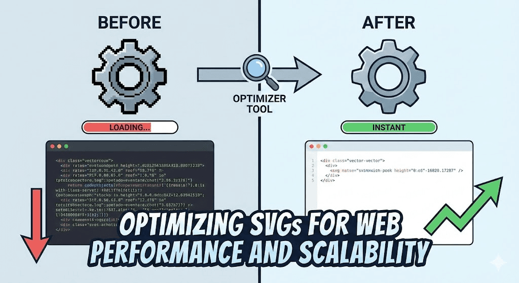
Advancements in SVG rendering engines are also expected to improve performance. Modern browsers are becoming more efficient at rendering complex SVG images, reducing the performance penalty associated with highly detailed vector graphics. Furthermore, techniques like SVG sprite sheets and lazy loading can help to optimize SVG delivery and improve page load times.
While WebP and optimized SVGs are likely to dominate the web in 2026, there are also emerging image formats to watch. AVIF, for example, offers even better compression than WebP, but its browser support is still limited. The rise of responsive images, driven by the `` element and `srcset` attribute, will also play a crucial role in delivering optimized images to different devices and screen sizes. It's a dynamic landscape, and staying informed about the latest developments is essential for maximizing web performance.
Real-World Scenarios: Choosing the Right Format
So, how do you apply this knowledge in practice? Let’s look at a few real-world scenarios. For logos and icons, SVG is almost always the best choice. Its scalability and small file size make it ideal for these elements. For photographs, WebP generally offers the best combination of compression and quality, but a well-optimized PNG can also be a viable option.
Complex illustrations with gradients and intricate details present a more challenging decision. If the illustration is relatively simple, SVG might be suitable. However, if it’s highly detailed, WebP is likely to be the better choice. Animated graphics can be handled effectively by both SVG (using CSS or JavaScript) and WebP (which supports animation natively).
Consider these website types: An e-commerce site with lots of product photos would benefit from extensive WebP use. A blog with custom illustrations and logos would leverage both SVG and WebP. A simple landing page might get away with optimized PNGs for a few key images, but even there, WebP would be preferable. The key is to analyze each image individually and choose the format that best meets its specific needs.
- Logos & Icons: SVG
- Photographs: WebP (primary), optimized PNG (fallback)
- Illustrations (simple): SVG
- Illustrations (complex): WebP
- Animations: SVG or WebP
Featured Products

Optimizes network applications for user-space development · Focuses on high-performance packet processing · Provides insights into low-level network stack tuning
While not a direct image converter, understanding data plane optimization can indirectly inform efficient data handling for web assets.
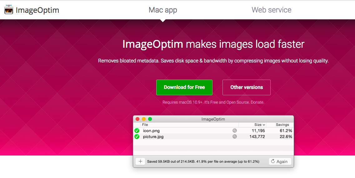
Lossless and lossy compression for various image formats · Reduces file sizes without significant quality degradation · Supports batch processing for efficient optimization
ImageOptim is recommended for its powerful compression capabilities, enabling users to significantly reduce the file sizes of PNG and WebP images for faster web loading.
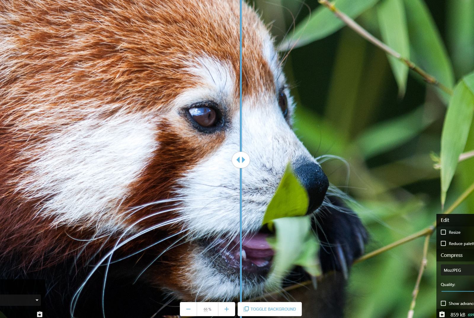
Web-based image compression and conversion tool · Supports a wide range of formats including WebP, PNG, and JPEG · Offers fine-grained control over compression settings
Squoosh is recommended for its user-friendly interface and advanced compression options, allowing for precise optimization of PNG and WebP files to improve web performance.

Comprehensive image editing and manipulation tools · Supports non-destructive editing workflows · Advanced features for retouching, compositing, and graphic design
Affinity Photo is recommended as a professional tool that can be used to prepare and optimize images, including converting them to formats like WebP, for enhanced web performance.

Professional-grade image editing and manipulation · Extensive tools for photographers and designers · Features for color correction, retouching, and creative effects
Adobe Photoshop CS5, while an older version, remains a powerful image editor that can be used to optimize images for web use, including conversion to efficient formats like WebP.
As an Amazon Associate I earn from qualifying purchases. Prices may vary.
No comments yet. Be the first to share your thoughts!